“The problem with the humanities,” Lev Manovich told me over a quick meal at a strip-mall sushi joint in La Jolla last January, “is that people tend to worry too much about what can’t be done, about mistakes, problems, as opposed to just going and doing something.”
It was almost 8:00 p.m. Manovich, a professor of visual arts at UC–San Diego, had already spent the better part of the day in faculty meetings, led a class of undergrads through a nearly three-hour session of Time-and Process-Based Digital Media II, attended an informational event hosted by Google, and caught up on the progress of several of his graduate and postdoctoral researchers. In a few minutes, he’d be on his way home to put the finishing touches on a work of video art that needed to be installed at a friend’s gallery in downtown San Diego the next day. Inertia, I thought—of the intellectual variety or any other—is simply not a part of this guy’s constitution. “Of course, visualizations can’t represent everything,” he continued. “Of course, there are limits, but let’s not spend all of our time talking about it—let’s go ahead and do it, let’s figure out what we can do, right?”
Manovich was expounding the merits of “cultural analytics”—which he inaugurated in a 2009 essay—“a new paradigm for the study, teaching, and public presentation of cultural artifacts, dynamics, and flows.” Inspired by both the explosion of media on the Internet in recent years (YouTube, Flickr, ARTstor) and the increasingly interactive nature of our everyday media experiences (browsing the Web, playing computer games, manipulating images in Photoshop), the general idea of cultural analytics is to apply data visualization and analysis techniques traditionally associated with the so-called hard sciences—graphing, mapping, diagramming, and so on—to the study of visual culture. The difference between Manovich’s essay and so many other attempts to outline potential intersections between new media and the humanities is that it was more of a report to the academy than a mere call to action.
Operating under the banner of the Software Studies Initiative, Manovich and a handful of other scholars at UCSD’s Center for Research in Computing and the Arts had already spent two years asking and taking practical steps toward answering such questions as, What can one do with the vast archives of cultural material now available, as we say, at the click of a button? Where might one begin a discussion of the aesthetic properties of the millions of user-generated videos posted online? How does one capture and summarize the dynamics of sixty-plus hours of video-game play?
The entire enterprise, they discovered early on, was not so straightforward as feeding new kinds of datasets into existing software systems and interpreting the results they spit out. As Manovich explained, there are too many assumptions and predetermined pigeonholes built into most scientific visualization technologies. “So, for example, you have some type of medical imaging technique that you use for distinguishing healthy cells from cancerous ones.” A great thing, of course, if you happen to be an oncologist or an oncologist’s patient. “But you don’t want to divide culture into a few small categories,” he said. “What’s interesting about culture is that the categories are continuous. Instead of using these techniques to reduce complexity, to divide data into a few categories, I want to map the complexity.”
Among a variety of approaches to cultural analytics that the Software Studies team has developed since 2007 is a new (though, Manovich was careful to point out, not entirely unprecedented) kind of visualization that they call “direct” or “non-reductive.” Unlike most visualizations, which use points, lines, and other graphical primitives to represent data by abstraction, direct visualizations use images of the actual cultural objects from which the data was derived in the first place. In other words, instead of creating a standard point-based scatter plot reflecting, say, the brightness of Mark Rothko’s paintings over time, a direct visualization of that dataset will show the same pattern by distributing images of the paintings themselves across the graph space. Beyond its obvious visual appeal, the method offers a number of practical advantages to the humanities scholar. Seeing the pattern in its original context “should allow you to notice all kinds of other patterns that are not necessarily represented in your measurements,” said Manovich. It also allows you to move quickly between close reading—focusing on a single Rothko painting—and what literary historian Franco Moretti has termed “distant reading”—viewing a whole set of Rothkos at once. And with a large enough collection of data, Manovich added, “you might even discover other ‘zoom levels’ from which you can look at culture that may not correspond to a book, an author, a group of authors, a historical period, but are equally interesting. You can slice through cultural data diagonally in all kinds of ways.”
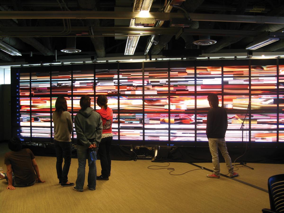
The day before, Manovich and Jeremy Douglass, a Software Studies postdoc with a background in literary theory and game studies, had shown me around some of the team’s recent data-slicing projects. They took me to the second floor of UCSD’s Atkinson Hall, where, at the edge of a large, cubicled workspace, the university keeps one of the highest resolution display systems in the world—the 238.5 square foot, 286.7 megapixel Highly Interactive Parallelized Display Space, or HIPerSpace, for short.
The first visualization they loaded was one of their simplest, but also most striking: a montage of every Time magazine cover published between March 3, 1923, (the first issue) and September 14, 2009—4,535 images in all. Laid out chronologically, beginning at the upper lefthand corner with a cover featuring Illinois Congressman Joseph G. Cannon and ending at the lower right with Jay Leno, the series immediately reveals certain patterns in magazine’s stylistic evolution: the shrinking of a decorative white border, the gradual transition from black-and-white to color printing, long periods in which certain hues come to dominate, and so on. From a distance, it’s a bit like looking at the annual growth rings of some felled ancient tree—except that instead of simply indicating a history of local climate conditions, the patterns here raise questions about the broader milieu in which the changes took place, about the nature of visual style, and perhaps even about the very idea of historical patterns. Visualization “makes the job of our visual system easier,” said Manovich, “but it’s not going to explain a pattern. It confronts you with something you wouldn’t notice otherwise, confronts you with new cultural facts. You see things that, probably, nobody has noticed before, new cultural patterns that you now have to explain.”
Another, slightly more sophisticated, approach to the same dataset—distributing the Time covers horizontally by date of publication and vertically according to relative color saturation levels (basically, vividness)—brought to light a number of “outliers,” data points that do not conform to the general pattern or range of the set as a whole. These, Douglass suggested, can help draw you into traditional close readings, but from angles that you might not have anticipated. “One cover out of forty-five hundred, a cover that might not have been significant to you if you were just searching indexes of Time or thinking about a particular topic, suddenly becomes significant in the context of a large historical or design system. It’s not that you would have known that it was important ahead of time—it’s not like, ‘Oh, this is the Finnegans Wake of Time covers’—it’s that, contextually, it’s significant. And when I dive into the visualization, I can actually see what these extremely saturated covers depict.”
As it turned out—and this seemed to come as a surprise to Manovich and Douglass—quite a few of those saturated outliers were covers that dealt in one way or another with communism. “Pure red, pure binary enemy, right?” laughed Manovich, who grew up in the Soviet Union during what he described as “the last stages of a decaying so-called Communist society.”
“You can think of each of these visualization techniques as a different photograph of your data,” said Manovich, “as photographs of your data taken from different points of view. If I were taking a photograph of Eduardo”—Eduardo Navas, another Software Studies researcher, who had joined us for the HIPerSpace demonstration—“I could take it from the front or from the side. I will notice in both photographs some of the same patterns, some of the same proportions, but each photograph will also give me access to particular information, each point of view will give me additional insights.”
When Douglass called up a visualization from another project, one in which the team analyzed and, in various ways, graphed over one million pages of manga (Japanese comics), Manovich remarked, “This is kind of our pièce de résistance.” It was easy to see why. Technically, the x-axis reflects standard deviation, and the y-axis, entropy—a configuration that results in the most detailed of the scanned pages, the ones with the most pictorial elements and intricate textures, appearing along the upper right curve of the graph, while the simplest, those dominated by either black or white space, trail off toward the lower left. But what most impressed me was the strangely immersive aesthetic experience it produced. What at first looked to me like a bell-shaped white blob set against a grey background, resolved, as Douglass zoomed in and around the visualization, into a complex field of truly startling density—pages from different comics, representing different genres, drawn by different artists, so crowded together that they overlap, seeming almost to compete with one another over the available space. This, it occurred to me, is about as close as I’ll ever get to stepping into one of Andreas Gursky’s photographs.
The team is aware of the artistic side of their work. In fact, their visualizations have been shown at a number of art and design venues, including the Graphic Design Museum in the Netherlands, the Gwangju Biennale in South Korea, and, last fall, at one of UCSD’s own exhibition spaces, the gallery@calit2. “For many people who enjoyed the show” at UCSD, Douglass said, “it was just about the visualization as a kind of spectacle and object of desire. They may not care about manga at all, may have no desire to read manga; but the idea that manga has a shape, or the idea that it’s all in one place—it’s a dream of flying over a landscape. It’s not about wanting to live there, it’s just the fact that you’re flying that’s so compelling.
“But,” he added, “that’s not my relationship to what I’m doing. I don’t spend half my time trying to make technical illustrations and half my time trying to create beautiful sculptures. I just move back and forth seamlessly through the space, and often don’t worry about which one I’m doing. I’ve noticed that some people will say, ‘That’s not an information visualization, that’s an artwork,’ and some people will say, ‘This is totally schematic, you did this procedurally and it’s just informative.’ But people who don’t have that kind of disciplinary anxiety just say, ‘That’s beautiful and interesting.’”
“Part of what I am trying to do,” Manovich said, “is to find visual forms in datasets which do not simply reveal patterns, but reveal patterns with some kind of connotational or additional meanings that correspond to the data. But partly, with something like the Time covers, I’m also trying to create an artistic image of history.”


