CoCensus: Engaging with Census Data in the Museum

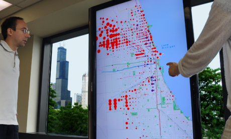
Pilot testing of the visualization of Chicago census data. Color-coded data points indicate the national ancestry of a subset of Chicagoans as reported in a 2005-2009 survey.
Photo by Paulo Guerro

Pilot testing of the visualization of Chicago census data. Color-coded data points indicate the national ancestry of a subset of Chicagoans as reported in a 2005-2009 survey.
Photo by Paulo Guerro
At the University of Illinois at Chicago, researchers Leilah Lyons and Josh Radinsky have formed a partnership with the Jane Addams Hull-House Museum to develop CoCensus, an innovative museum exhibition that will ultimately allow visitors to interact with Chicago census data in engaging new ways. Funded through the Digital Humanities Start-Up Grants program and currently in the prototyping stages, the exhibit uses RFID (Radio Frequency Identification) cards that will hold information about museum visitors’ self-identified racial, ethnic, or national background. Equipped with a wireless card, visitors will then be able to interact with a map display that uses their demographic information to depict a visual representation showing where present-day Chicagoans who reported the same ancestry in the 2005-2009 American Community Survey were living. For instance, if your family immigrated to the United States from Mexico, on the map would appear color-coded data showing where Chicagoans of Mexican ancestry were living in 2005-2009. As multiple visitors move toward the map, Microsoft Xbox Kinect technology will track their movements to visually distinguish data related to individual participants and help them understand how communities with different historical identities continue to live in relation to one another.
The project team is working with museum visitors to complete a number of trials on the pilot exhibit, and plans to continue refining and developing it in the future to include additional maps, historical time periods, and other data exploration features that might extend to different museum contexts. By answering a few of our questions below, Leilah and Josh shed light on the project’s background, its goals, and the complexity of the design process.
How did the idea for this project come about?
Dr. Lyons’ lab had been developing and studying novel approaches for employing technology within museum exhibits to support collaborative learning in science museums, while Dr. Radinsky had been studying ways data visualizations of Census data could be used by teachers and students in history classrooms. Both were intrigued by the possibility of combining their research interests in a new context, and saw the potential value in creating a museum exhibit that would allow visitors to interact with large data sets in a museum focused on social history and immigrant identity.
In what ways are you collaborating with the Hull-House Museum? How does this project relate to the museum’s mission and other initiatives?
Prior to designing anything, our team spent extensive time in the museum, both in the context of drop-in visits as well as attending tour groups conducted by the museum staff…We specifically discussed the connection of modern GIS census data to the Hull House’s pioneering demographic mapping work performed in the late 19th century (The Hull-House Maps and Papers), which marked a pioneering use of spatially-mapped demographic information to advocate for social change. We view our exhibit as a more modern take on the Hull-House Maps and Papers, providing visitors the opportunity to reflect on their personal connections to these communities, and (in the next phase of the design) on how immigrant communities in Chicago have changed over the decades. The Hull House has a strong orientation towards advocacy not often seen in museums; their goal is to help visitors see themselves as possible agents of change. We hope that our exhibit can help visitors start asking the kinds of questions that lead one to think deeply about identity, community, and social change.
What have you found challenging or surprising?
We’ve been surprised by how the different versions of the exhibit design supported very different kinds of visitor conversations. Even “small” changes in the visualization design and in the interaction design resulted in different conversations about the data, and different expressed conceptions about place and identity. In terms of challenges, we’ve needed to do more work than we had expected to find a good set of interaction strategies that are well-suited to the context of this museum, both in terms of accommodating the activity preferences of their typical visitors and to the peculiarities of constructing a digital exhibit in a historical building. Another challenge arises from the fact that the visualization design has to support dynamic representation of the data – this imposes very different design requirements than what is typically found in static displays of geospatial data, and has challenged us to find appropriate and effective ways to visualize data when it is responsive to visitor actions.
How might your project serve as a model for others in cultural heritage organizations or other settings?
We hope that the design strategies we have uncovered for both the interaction with, and visualization of, large data sets can be adapted by other informal educational settings in which the public can explore large, spatially-referenced data sets. Another interesting model is our collaborative process itself – far too often the design of new interactive technologies is driven either by content specialists who do not necessarily understand how to best leverage the affordances of emerging technologies, or by technologists who understand the technology but do not necessarily understand the critical nuances inherent in the content…We structured our process so that the design would evolve through the continuous co-participation of all partners in the grant, and the repeated exposure to each other’s worlds of concern (whether they be discussions of the perceptual salience of transit lines on the map, or debates on the most effective data structures for quickly updating data points) helped each side better understand the varied motivations driving the project, and allowed us to make ever-wiser design decisions as the project progressed. We hope that our project can serve as a model of how a meaningful cross-disciplinary collaboration can take place.
[Note: This Q&A has been edited for length.]